ARKON
/ BRANDING / COMPANY LOGO / GRAPHIC CONCEPT / PHOTO RETOUCHING / CATALOG DESIGN / PREPRESS / PRINT /
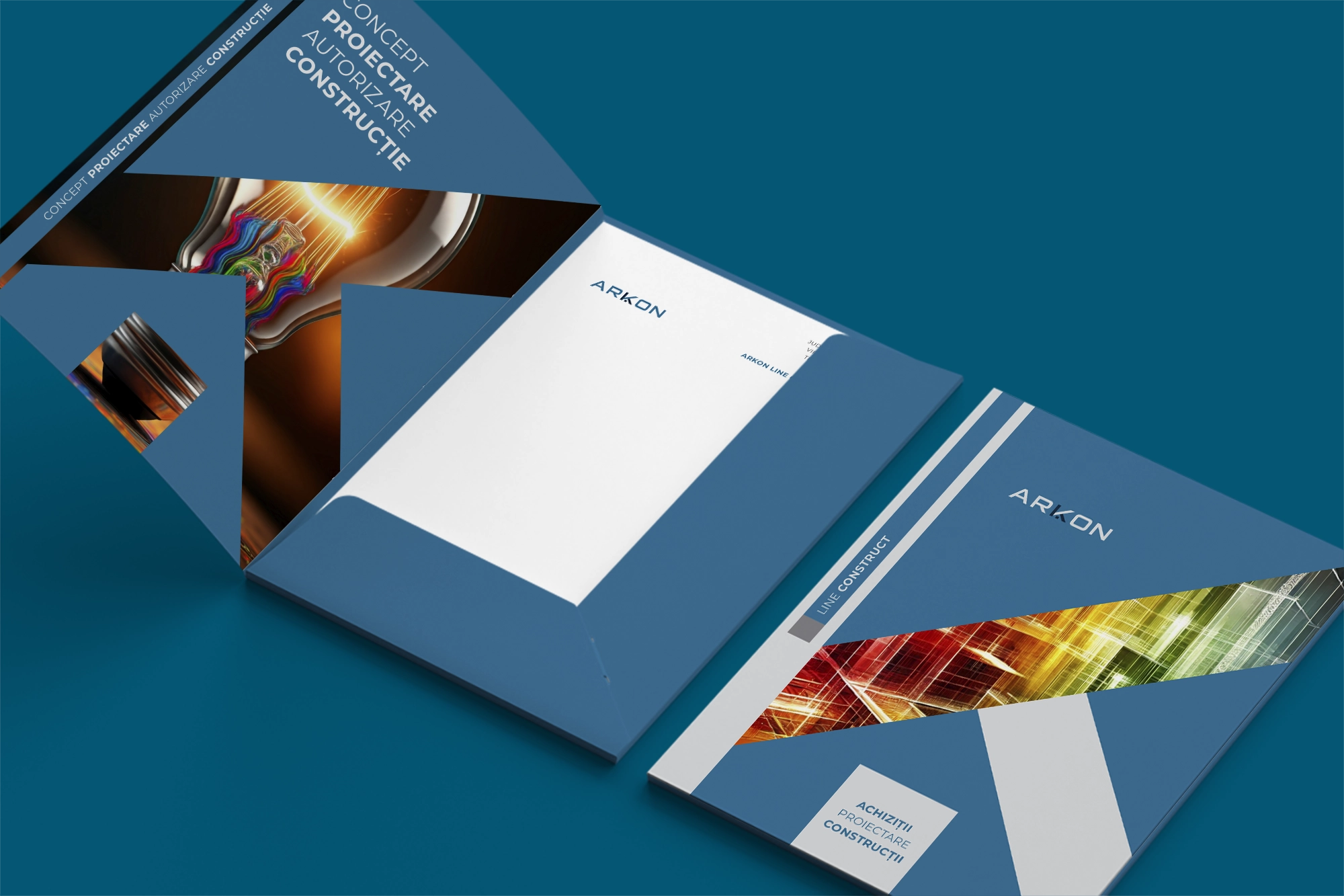
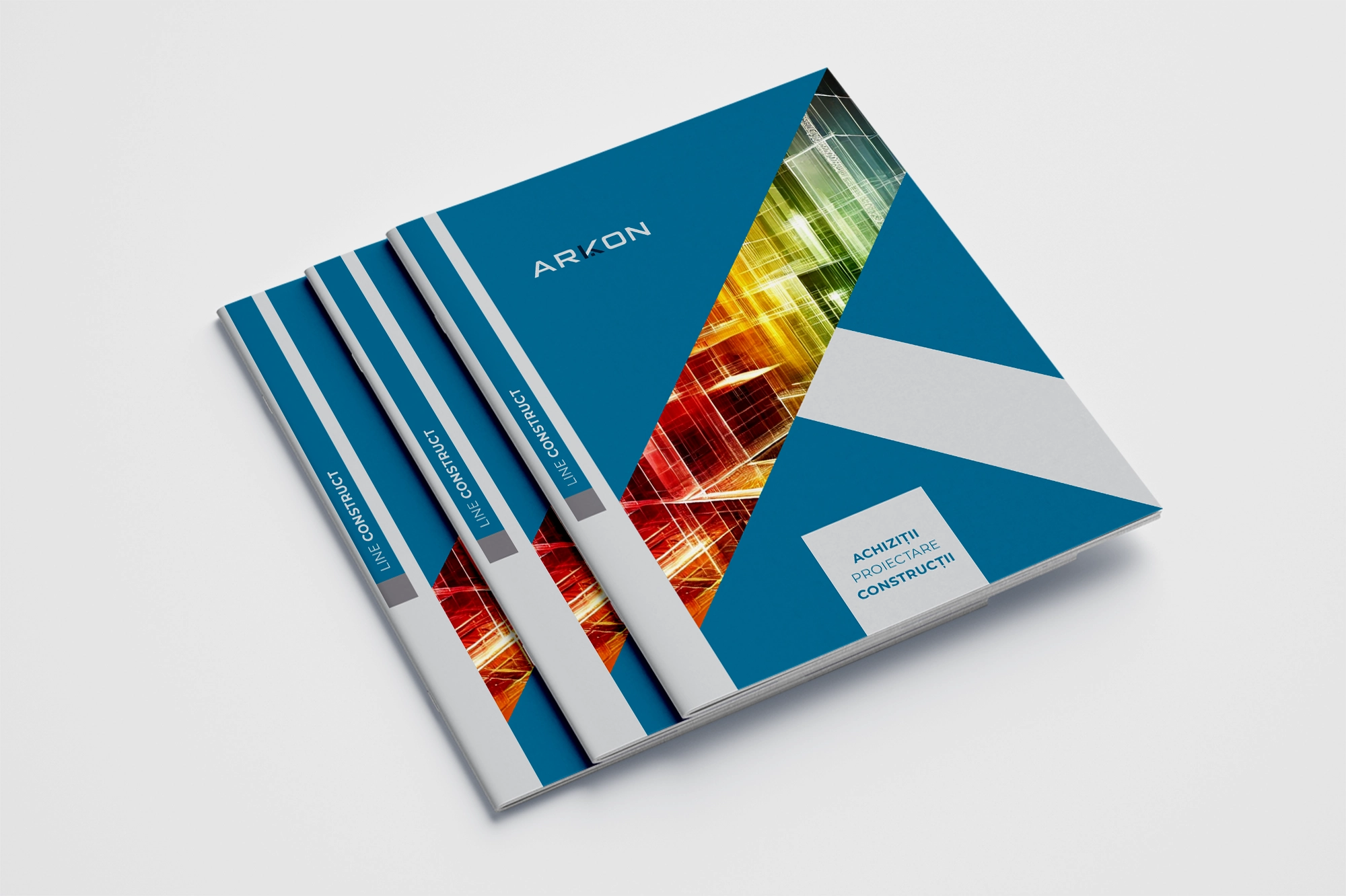
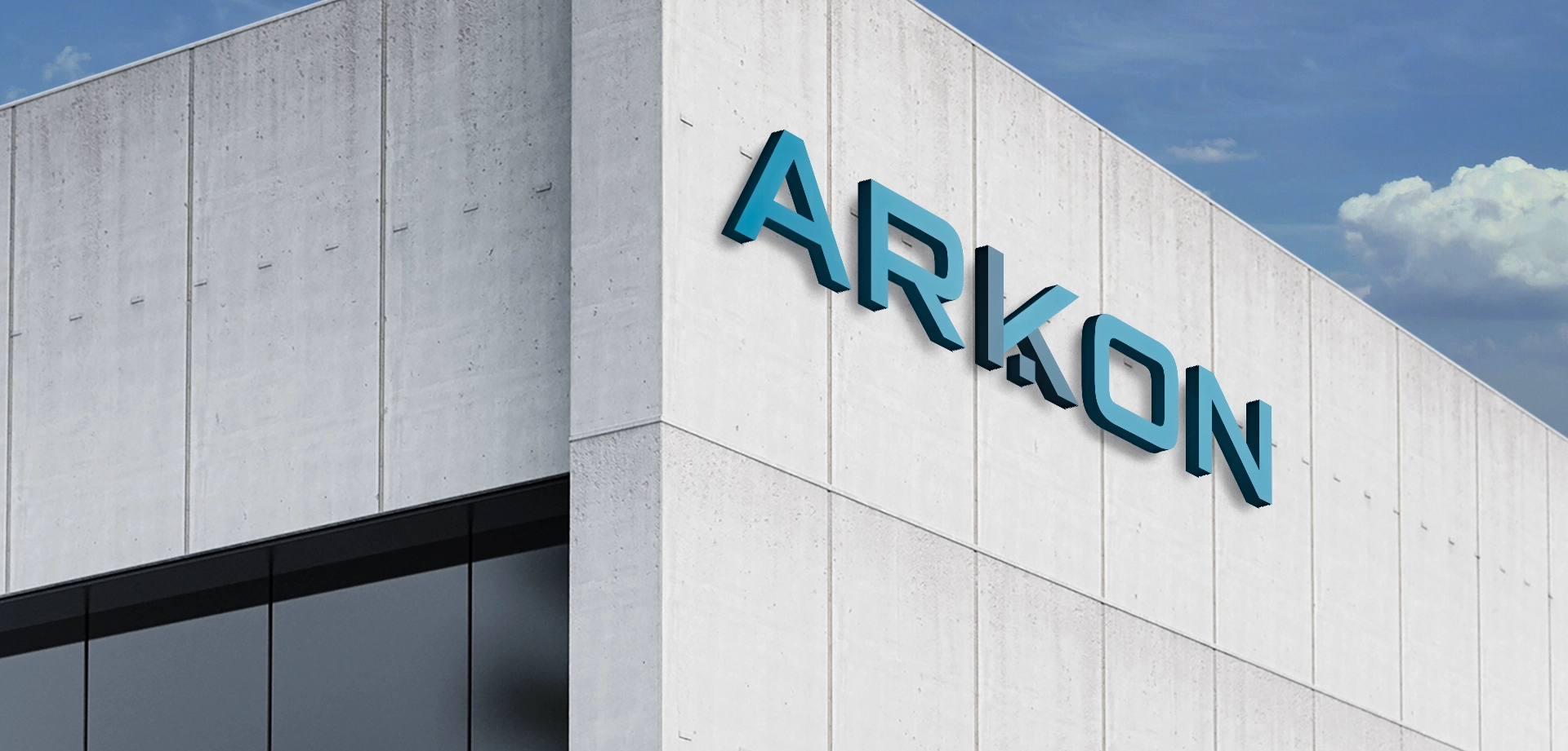
The visual identity developed by Guliman for ARKON, a construction company, establishes a strong, modern, and trustworthy corporate presence. The branding system is built on clean geometry, bold color fields, and a disciplined blue‑gray palette that communicates stability, engineering precision, and long‑term reliability — essential qualities in the construction industry.
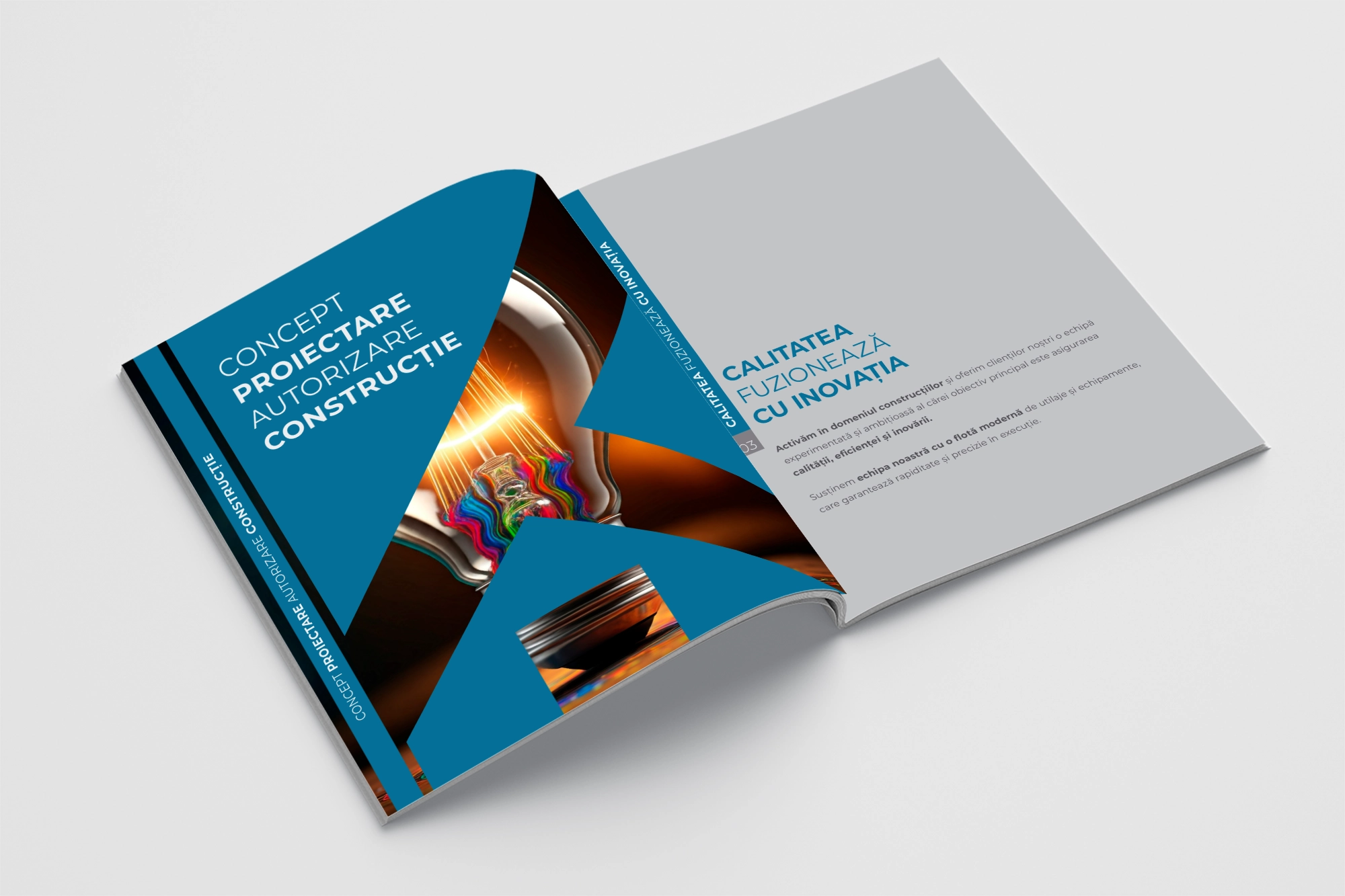
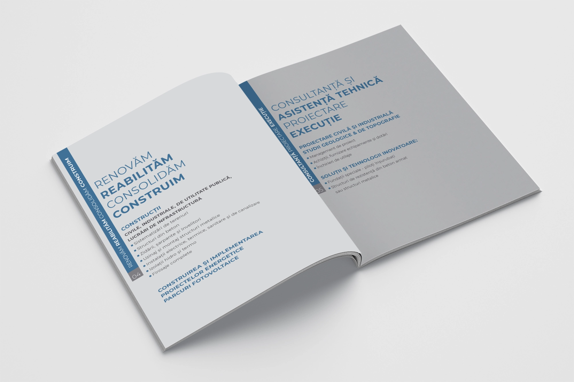
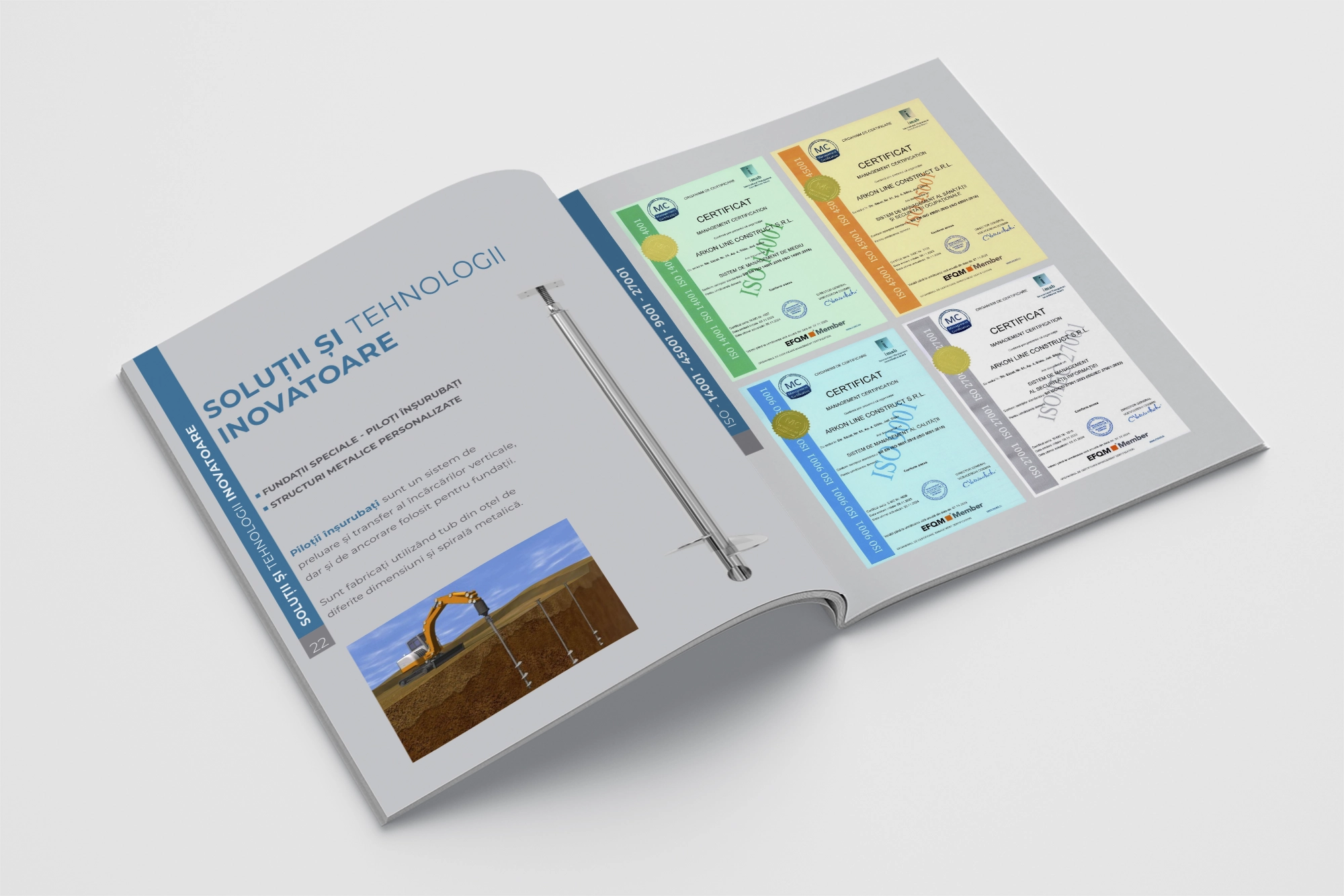
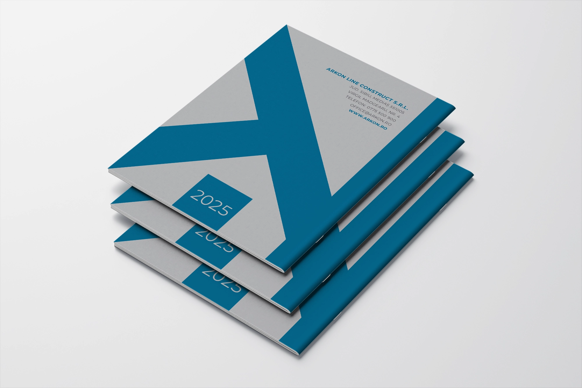
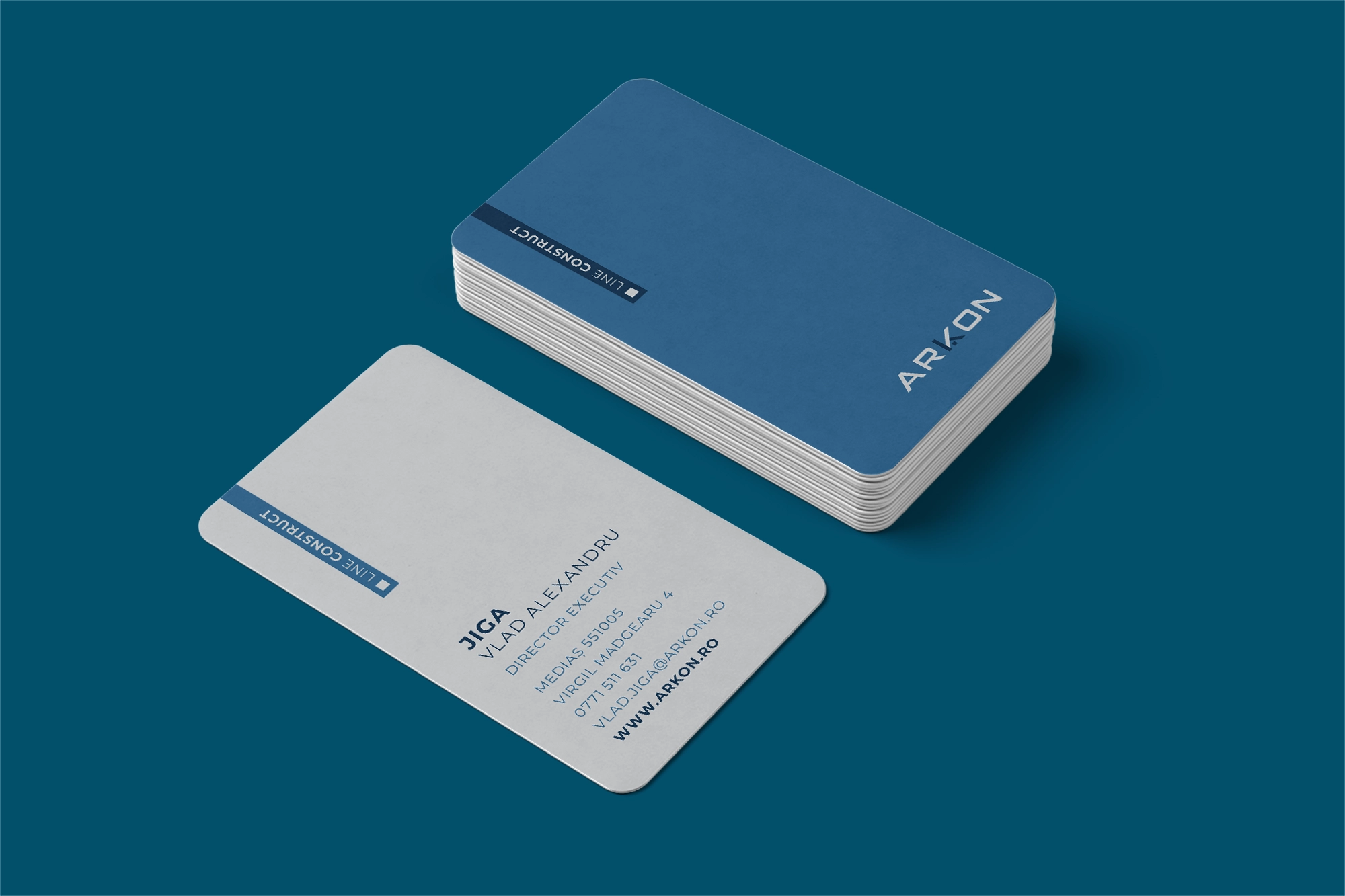
The business cards, presentation folders, and printed materials form a cohesive and highly functional identity toolkit. Each element is designed with clarity and hierarchy in mind, ensuring that the brand remains instantly recognizable across all formats. The business cards feel premium and minimal, the folders are structured and elegant, and the brochures and presentations convey competence and professionalism.
Through thoughtful design and a unified graphic language, Guliman transforms ARKON into a contemporary, credible, and visually consistent brand. The identity doesn't just look good — it works. It communicates efficiency, organization, and technical capability. This project stands as a complete branding solution, where every component — from business cards to corporate presentations — contributes to a strong and coherent brand image.